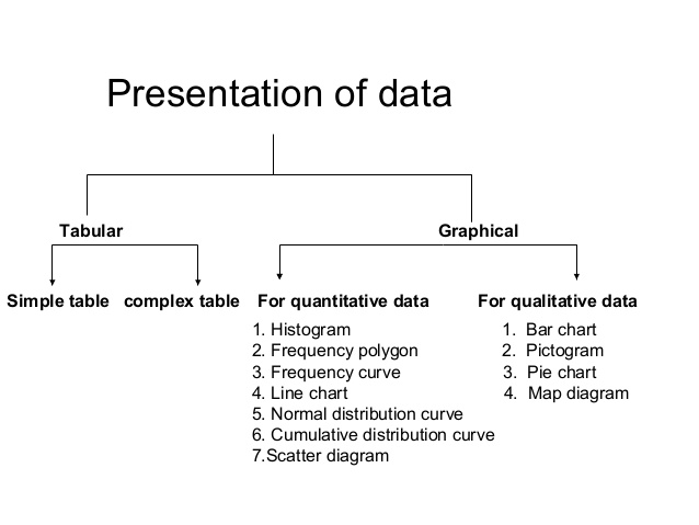
There are two main methods of presenting data of a variable character or a variable.
A) Tabulation/Tabular Presentation
B) Drawing/Graphical Presentation
Tabulation
Tabulation is a device for presenting data from a mass of statistical data. Preparation of frequency distribution table is the first requirement for that. Tables are often simple or complex depending upon the measurement of a single set of things or multiple sets of things.
Frequency Distribution
The distribution of the overall number of observations among the various categories is termed as frequency distribution.
Frequency Distribution is a very important step in statistical analysis. It groups a sizable amount of series or observations of the master table and presents the data very concisely, giving all information at a look.
It records how frequently a characteristic or an occurrence occurs in persons of the same group. Data are often recorded within the sort of frequency table.
In short, collecting and summarizing a great amount of data is called frequency distribution.
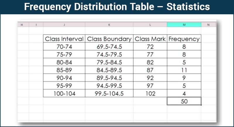
Rules for Making Frequency Distribution Table
Best safe and secure cloud storage with password protection
Get Envato Elements, Prime Video, Hotstar and Netflix For Free
Best Money Earning Website 100$ Day
#1 Top ranking article submission website
- The class or group interval between the groups should not be excessively broad or narrow. Too large a group will omit the details and too small will defeat the purpose of making the data concise.
- The number of groups or classes should not be too many or very few but ordinarily between 6 and 16 depending on the details necessary and the size of the sample.
- The class interval should be the same.
- The headings must be clear for instance “height” in inches or in centimeters, “age” in years or months. If the data are expressed as rates mention percent or per thousand.
- The rates and proportions, if given the actual number in the group must also be noted.
- Groups should be tabulated in ascending or descending order.
- If certain data are omitted or excluded deliberately, the reasons for doing that should be given.
Types of Tabulation
- Simple Tabulation
- Complex Tabulation
1. Simple Tabulation
Simple Tabulation is when the information/data are tabulated to one characteristic. For example, the survey determined the frequency or number of employees of a firm owning different brands of mobile phones.
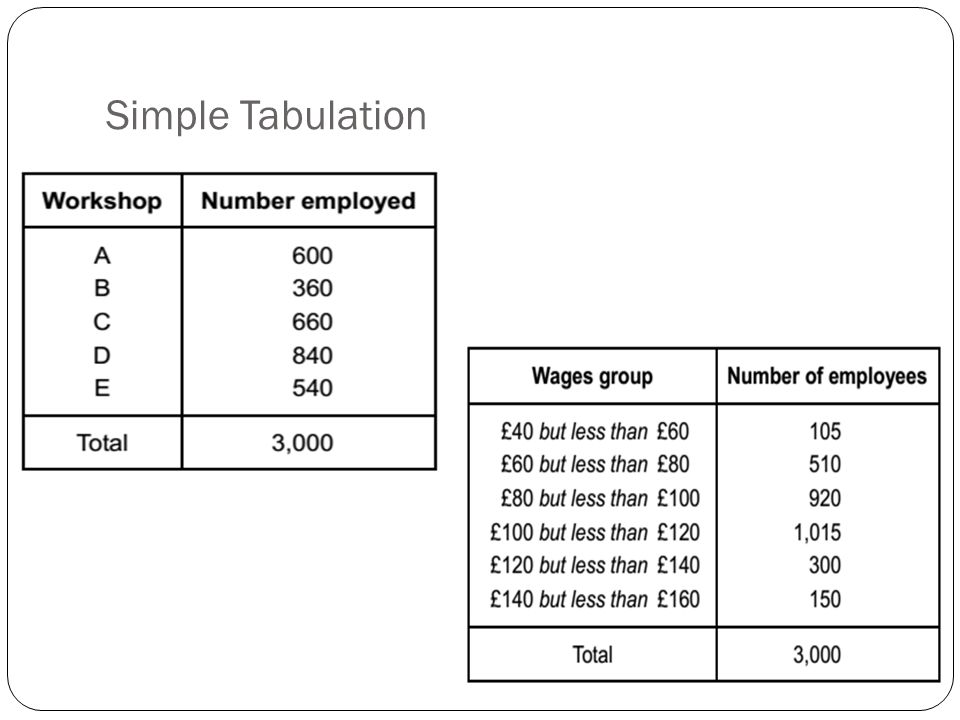
2. Complex tabulation
When the data are tabulated consistently with many characteristics, it is said to be a complex tabulation.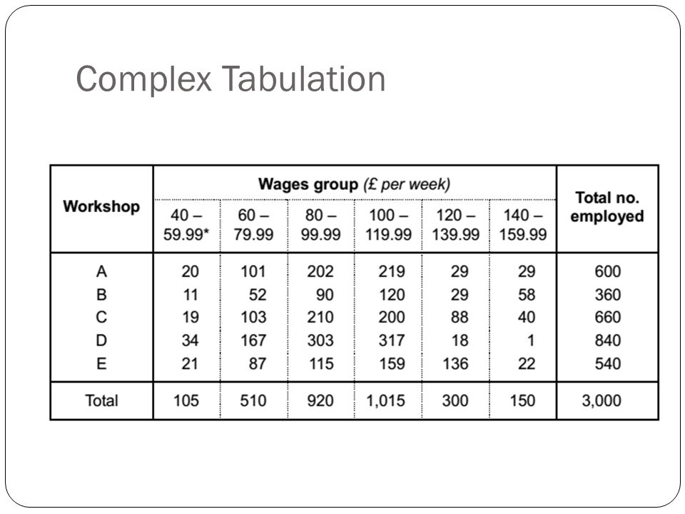
Grafical Distribution
According to the type of data, graphical distribution or drawing is categorized as follows:
A) Graphs for quantitative data
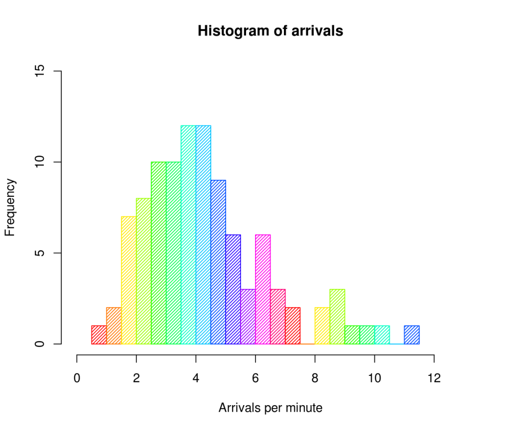
1) Histogram
A histogram is a graphical display of data using bars of various heights. In a histogram, each bar groups numbers into ranges. Taller bars show that more data falls in this range. A histogram displays the form/shape and spread of continuous sample data.
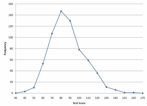
2) Frequency Polygon
A frequency polygon is a graph constructed by using lines to join the midpoints of every interval or bin. The heights of the points depict the frequencies. A frequency polygon is usually created from the histogram or by calculating the midpoints of the bins from the frequency distribution table.
3) Frequency Curve
A frequency curve is a smooth curve for which the entire area is taken to be unity. It’s a limiting sort of a histogram or frequency polygon. The frequency curve for distribution is obtained by drawing a smooth and freehand/blank check curve through the mid-points of the upper sides of the rectangles forming the histogram.
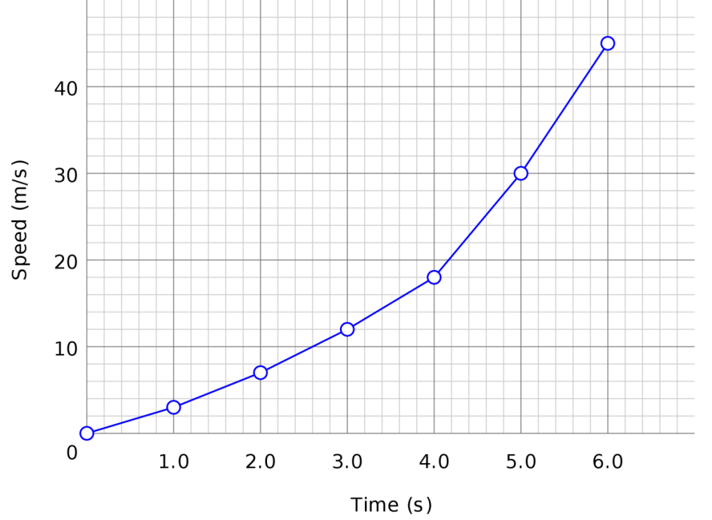
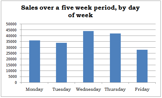
4) Line Chart
A line chart is a graphical representation of an asset’s historical price action that connects a series of data points with a continual line. This is often the foremost basic type of chart used in finance and typically only depicts a security’s closing prices over time.
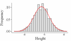
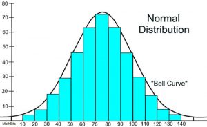
5) Normal Distribution Curve
A normal distribution is a type of continuous probability distribution for a real-valued random variable. A normal distribution is usually informally called a bell curve.
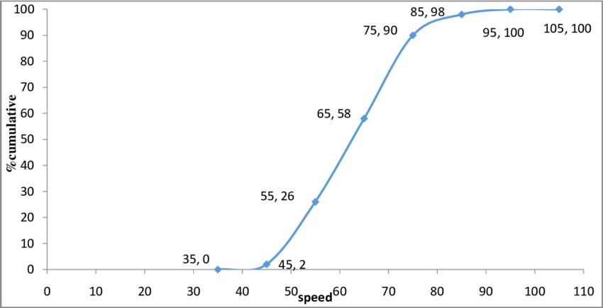
6) Cumulative Distribution Curve
In statistics, the cumulative distribution function of a real-valued random variable, or just distribution function of, evaluated at, is the probability that will take a value less than or adequate to.
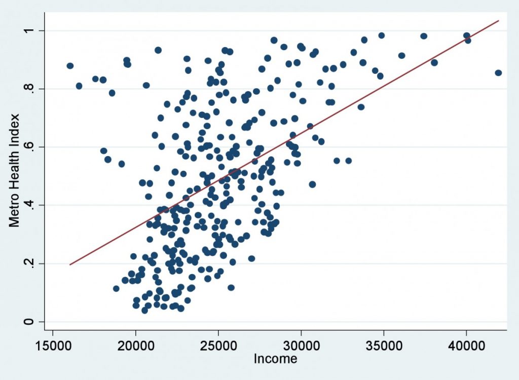
7) Scatter Diagram
A graph during which the values of two variables are plotted along two axis, the pattern of the resulting points revealing any correlation present.
B) Diagrams for qualitative data
1) Bar Chart
A bar chart or bar graph is a chart or graph that presents categorical data with rectangular bars with heights or lengths proportional to the values that they represent. The bars can be often plotted vertically or horizontally. A vertical bar chart is usually called a column chart.
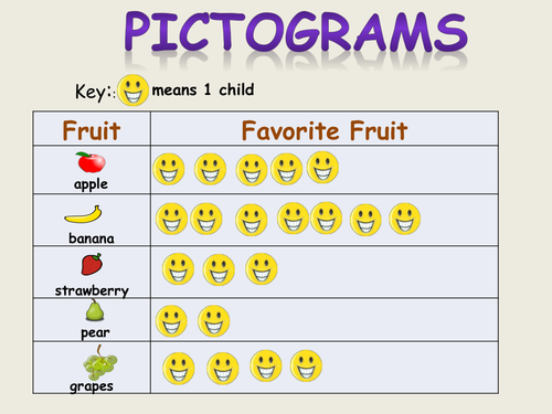
2) Pictogram
A pictogram is a chart that uses pictures to represent data. Pictograms are set out in the same way as to bar charts, but rather than bars they use columns of pictures to point out the numbers involved.
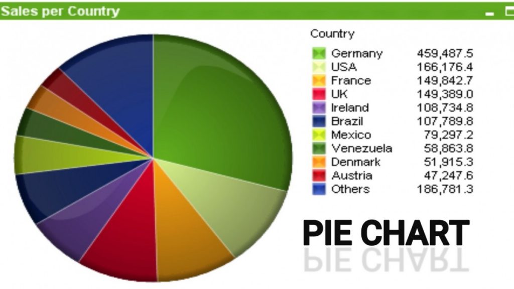
3) Pie Chart
A pie chart is a sort of graph in which a circle is split into sectors that each represents a proportion of the entire. Pie charts are a useful way to organize data in order to see the size of components relative to the entire and are particularly good at showing percentage or proportional data.
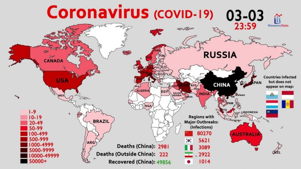
4) Map Diagram
A map diagram is a way of representation of any event distribution by means of diagrams, that are placed on the map inside the structure of territorial division which expresses the summarized value of this event within the bounds of this territorial structure.
Q&A
You Are interested in the percentage of female versus male shoppers at a department store.
Which chart or graph would be appropriate to display the proportion of males versus females among the shoppers?
A)A bar graph
B)A time plot
C)A pie chart
D)Choices (A) and (C)
E)Choices (A),(B) and (C)
Ans: (D)
Gender is a qualitative variable, so both bar graphs and pie charts are appropriate to display the proportion of males versus females among the shoppers. You could use a time plot only if you knew how many males and how many females were in the store at each individual time period.
Ref:Statistics: 1,001 Practice Problems For Dummies
Source:
1. Feature image: https://epthinktank.eu/2015/08/17/eprs-graphic-warehouse-when-a-picture-tells/amp/
2. Methods of Biostatistics- Mahajan
Revised by:
1. Tarek siddiki Taki ( 08.08.2020)